YONO SBI App (Redesign)
YONO SBI App (Redesign)
Redesigned the YONO app’s bank transfer feature to make it easier, faster, and more user-friendly. The new design improves navigation, reduces steps, and creates a smoother experience.
Redesigned the YONO app’s bank transfer feature to make it easier, faster, and more user-friendly. The new design improves navigation, reduces steps, and creates a smoother experience.
Project Type
UI/UX Redesign
Tools Used
Figma, FigJam
Industry
Banking & Finance
Duration
2 Weeks (Dec 2024)
Project Type
UI/UX Redesign Challenge
Tools Used
Figma, FigJam
Industry
Banking & Finance
Duration
2 Weeks (Dec 2024)
Project Overview
Project Overview
The YONO SBI app redesign focuses on improving the bank transfer flow to make digital banking more intuitive, user-friendly, and efficient. This project simplifies the money transfer experience by reducing complexity, decluttering the interface, and ensuring that key actions are clearly visible and easy to access. The redesign aims to meet the needs of both tech-savvy users and those less familiar with digital banking.
The YONO SBI app redesign focuses on improving the bank transfer flow to make digital banking more intuitive, user-friendly, and efficient. This project simplifies the money transfer experience by reducing complexity, decluttering the interface, and ensuring that key actions are clearly visible and easy to access. The redesign aims to meet the needs of both tech-savvy users and those less familiar with digital banking.
Goals & Success Criteria
Goals & Success Criteria
The existing YONO interface faced usability issues—confusing screens, lack of visual hierarchy, and a tedious multi-step transfer process. Many users found it difficult to quickly send money or understand the steps involved. The goal of this redesign was to eliminate friction in everyday banking tasks and enhance trust through a clearer and faster experience.
The existing YONO interface faced usability issues—confusing screens, lack of visual hierarchy, and a tedious multi-step transfer process. Many users found it difficult to quickly send money or understand the steps involved. The goal of this redesign was to eliminate friction in everyday banking tasks and enhance trust through a clearer and faster experience.
Problem Statement
Problem Statement
How might we redesign the bank transfer flow in the YONO app to reduce user confusion, improve task completion time, and make money transfers smoother for users of all experience levels?
How might we redesign the bank transfer flow in the YONO app to reduce user confusion, improve task completion time, and make money transfers smoother for users of all experience levels?
The Previous interface of SBI YONO
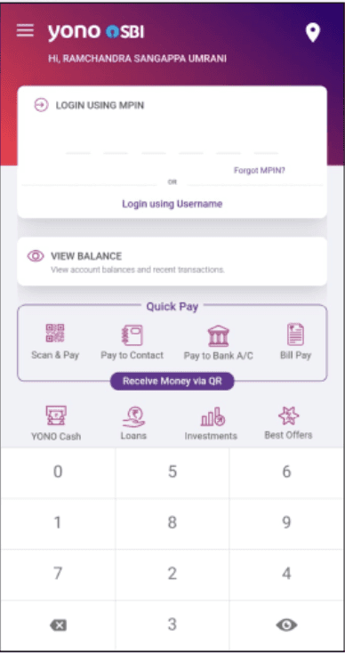
Unnecessary background elements clutter the screen and distract the user.
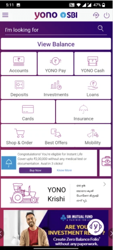
Lack of proper spacing, grouping, and hierarchy makes the UI feel chaotic and reduces usability.

Manual entry of account details is time-consuming.
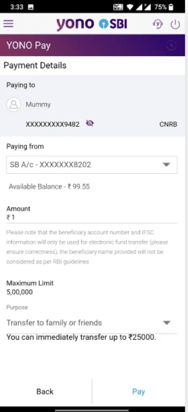
Screen layout is cluttered, with poorly placed elements and no clear visual guidance.
OTP screen lacks auto-detection and clear input visibility, slowing down the user experience.
Transaction popup looks outdated and doesn’t display information clearly.
The Previous interface of SBI YONO
Unnecessary background elements clutter the screen and distract the user.
Lack of proper spacing, grouping, and hierarchy makes the UI feel chaotic and reduces usability.
Manual entry of account details is time-consuming.
Screen layout is cluttered, with poorly placed elements and no clear visual guidance.
Transaction popup looks outdated and doesn’t display information clearly.
OTP screen lacks auto-detection and clear input visibility, slowing down the user experience.
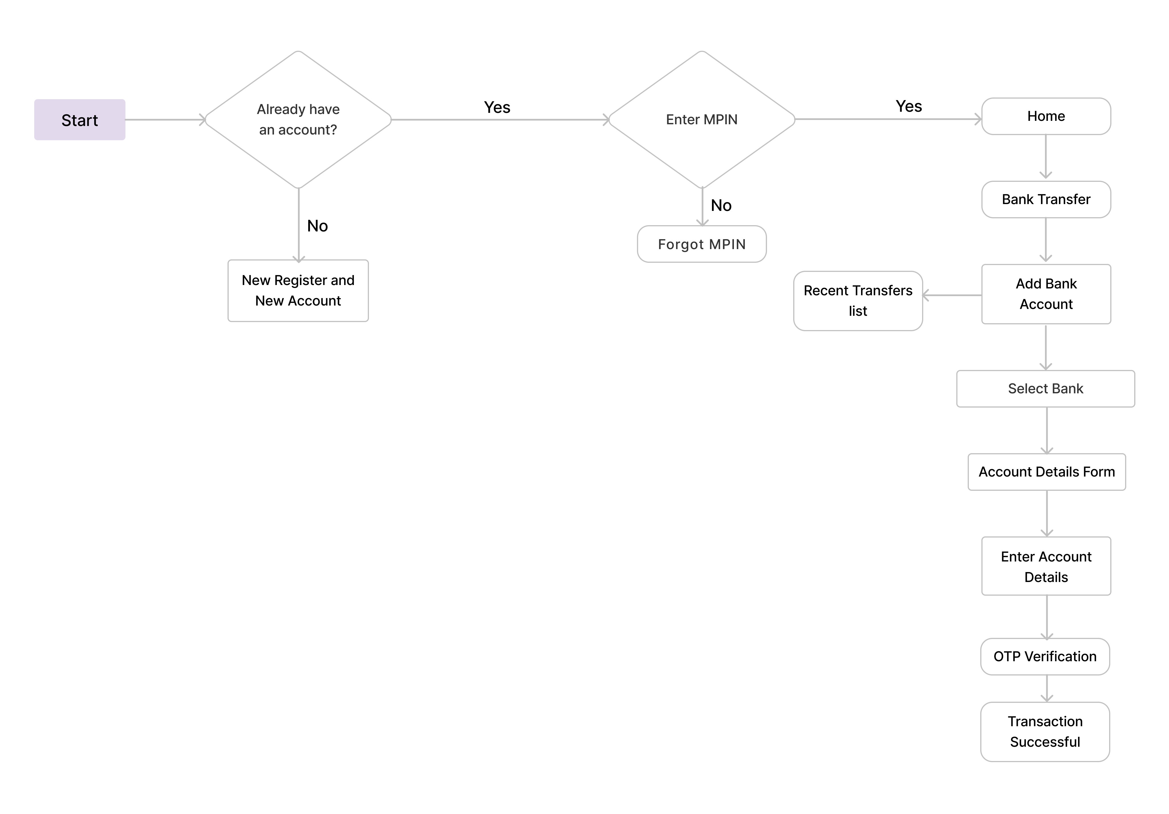
User Flow
Based on the user's goals and key tasks, we mapped a simplified user flow for the YONO SBI app. This flow helped us streamline the navigation and reduce unnecessary steps, ensuring a smoother and faster banking experience for the user.
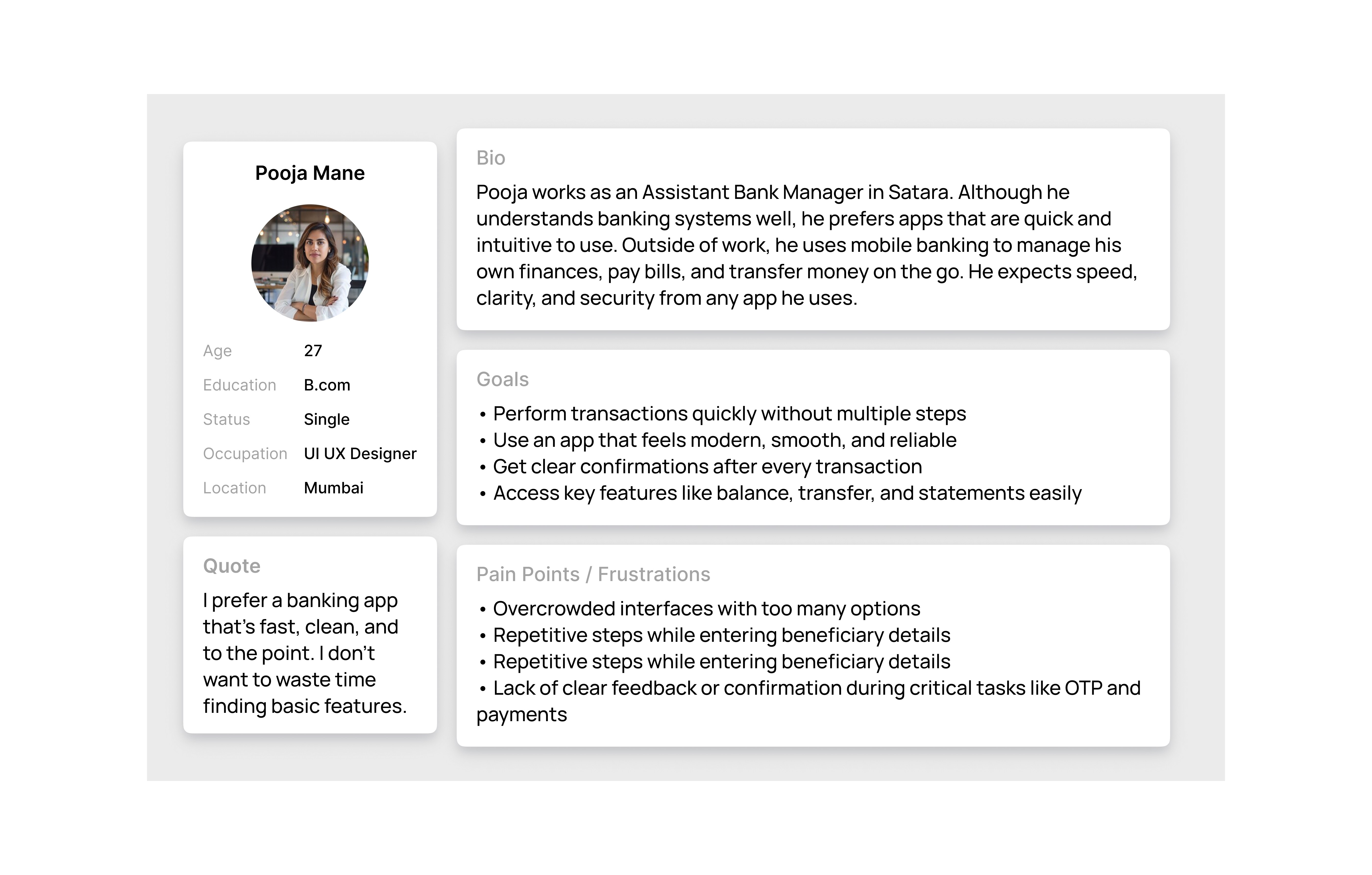
User Persona
To create a user-centered design for the YONO SBI app, we developed a user persona representing our target audience. This helped us understand the user's behavior, needs, frustrations, and goals. The insights from this persona guided key design decisions throughout the project.
Pooja Mane

Age
27
Education
B.com
Status
Single
Occupation
Bank Manager
Location
Satara
Quote
I prefer a banking app that's fast, clean, and to the point. I don't want to waste time finding basic features.
Bio
Pooja works as an Assistant Bank Manager in Satara. Although he understands banking systems well, he prefers apps that are quick and intuitive to use. Outside of work, he uses mobile banking to manage his own finances, pay bills, and transfer money on the go. He expects speed, clarity, and security from any app he uses.
Goals
• Perform transactions quickly without multiple steps
• Use an app that feels modern, smooth, and reliable
• Get clear confirmations after every transaction
• Access key features like balance, transfer, and statements easily
Pain Points / Frustrations
• Overcrowded interfaces with too many options
• Repetitive steps while entering beneficiary details
• Repetitive steps while entering beneficiary details
• Lack of clear feedback or confirmation during critical tasks like OTP and payments
User Persona
To create a user-centered design for the YONO SBI app, we developed a user persona representing our target audience. This helped us understand the user's behavior, needs, frustrations, and goals. The insights from this persona guided key design decisions throughout the project.
User Survey
To better understand user behavior and pain points, we conducted a short user survey focused on their experience with the current YONO SBI app. The feedback revealed key frustrations around app speed, navigation, and clarity, which guided our redesign decisions.
What is your age group?
18–24
60.5%
25–34
30.2%
35–44
7.5%
45+
1.8%
How was your experience using the YONO SBI app?
Great
19.2%
Good
36.5%
Okay
28.8%
Poor
15.3%
How often do you use mobile banking?
Daily
48.1%
Weekly
32.7%
Monthly
17.3%
Never
1.9%
Was the onboarding process easy to understand?
Yes
43.2%
25–34
30.2%
No
56.8%
45+
1.8%
What feature do you use most in the app?
Balance
40.4%
Transfer
34.6%
Bills
15.4%
Other
9.6%
Did you face any issues while adding a beneficiary?
Yes
51.9%
25–34
30.2%
No
48.1%
45+
1.8%
Review Research
Analyzed user feedback and ratings from the Play Store to identify real pain points and feature gaps in the existing apps. These insights guided improvements in UX decisions for a better user experience.


Design System
To maintain visual consistency across the app, we created a basic design system. It includes the color palette, typography, iconography, and components used throughout the redesign. This system ensures a cohesive and user-friendly interface.
User Flow
Based on the user's goals and key tasks, we mapped a simplified user flow for the YONO SBI app. This flow helped us streamline the navigation and reduce unnecessary steps, ensuring a smoother and faster banking experience for the user.
Yes
Yes
No
No
User Survey
To better understand user behavior and pain points, we conducted a short user survey focused on their experience with the current YONO SBI app. The feedback revealed key frustrations around app speed, navigation, and clarity, which guided our redesign decisions.
What is your age group?
18–24
60.5%
25–34
30.2%
35–44
7.5%
45+
1.8%
How was your experience using the YONO SBI app?
Great
19.2%
Good
36.5%
Okay
28.8%
Poor
15.3%
How often do you use mobile banking?
Daily
48.1%
Weekly
32.7%
Monthly
17.3%
Never
1.9%
Was the onboarding process easy to understand?
Yes
43.2%
25–34
30.2%
No
56.8%
45+
1.8%
What feature do you use most in the app?
Balance
40.4%
Transfer
34.6%
Bills
15.4%
Other
9.6%
Did you face any issues while adding a beneficiary?
Yes
51.9%
25–34
30.2%
No
48.1%
45+
1.8%
Review Research
Analyzed user feedback and ratings from the Play Store to identify real pain points and feature gaps in the existing apps. These insights guided improvements in UX decisions for a better user experience.
Wierframe
Wierframe
Before moving to the final visual design, I created low-fidelity wireframes to plan the structure, layout, and user journey. These wireframes helped visualize the app's flow and ensured clarity in navigation and functionality before designing the UI.
Before moving to the final visual design, I created low-fidelity wireframes to plan the structure, layout, and user journey. These wireframes helped visualize the app's flow and ensured clarity in navigation and functionality before designing the UI.
Design System
To maintain visual consistency across the app, we created a basic design system. It includes the color palette, typography, iconography, and components used throughout the redesign. This system ensures a cohesive and user-friendly interface.
Colors
Primary
900
800
700
600
500
400
300
200
100
Text
900
800
700
600
500
400
300
200
100
Typography
Font Name - Inter
Text Style
Weight
Size
Line
Heading 1
Semi Bold
18
28
Heading 2
Medium
18
24
Subtital 1
Semi Bold
16
24
Subtital 2
Medium
16
24
Body 1
Semi Bold
14
24
Body 2
Regular
14
20
Body 3
Semi Bold
12
20
Body 4
Regular
12
20
Shadow
Icons
Outline
Fill
Grid And Spacing
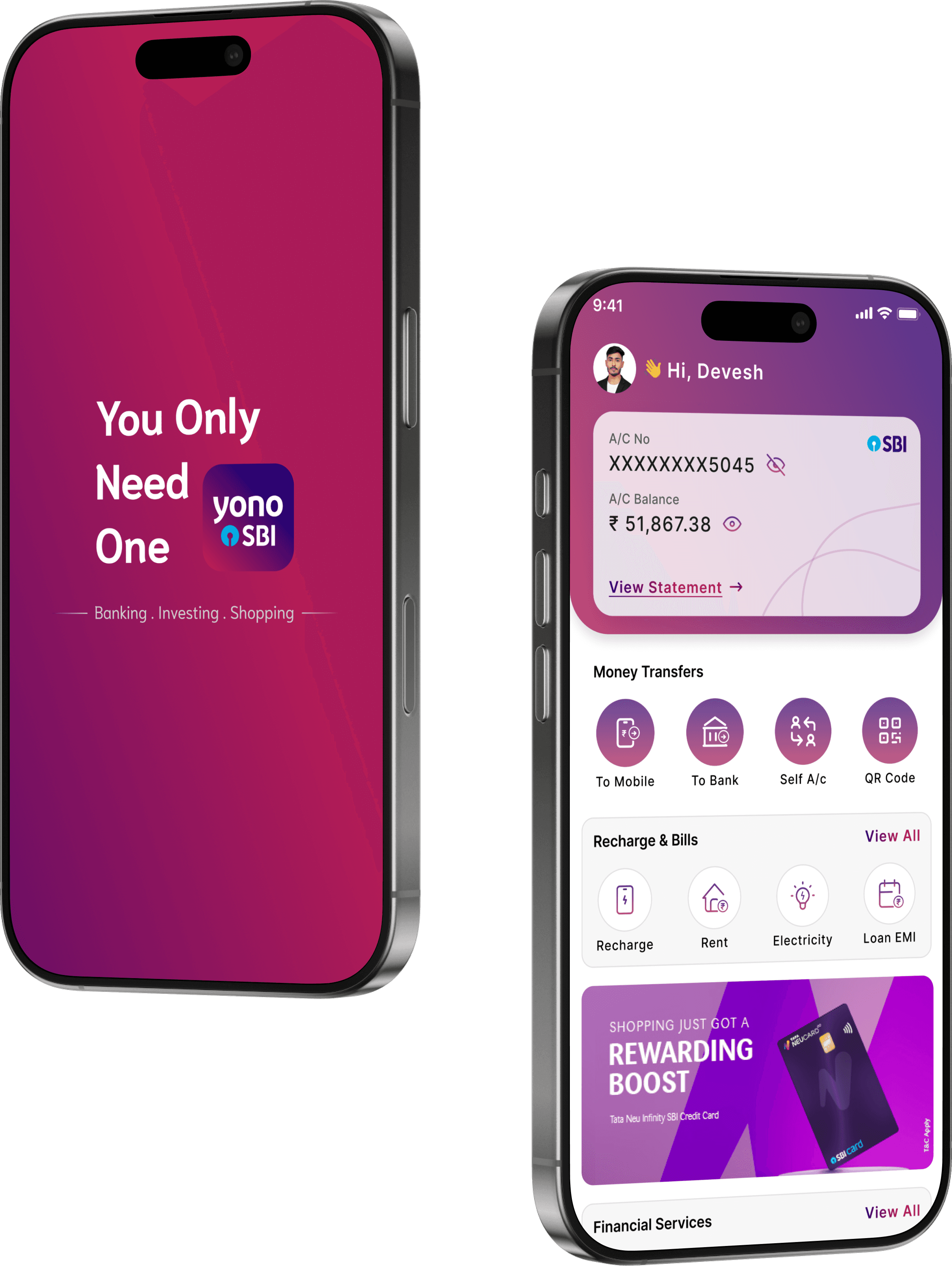
Final Design
Final Design
After validating the structure through wireframes, I moved on to the high-fidelity UI design. The final design reflects a clean, user-friendly interface with a focus on usability, accessibility, and visual consistency across all screens. Colors, typography, and spacing were used carefully to enhance the overall user experience.
After validating the structure through wireframes, I moved on to the high-fidelity UI design. The final design reflects a clean, user-friendly interface with a focus on usability, accessibility, and visual consistency across all screens. Colors, typography, and spacing were used carefully to enhance the overall user experience.
Let’s Talk
deveshgole1123@gmail.com
Comparison
The previous design had several usability issues such as cluttered layout, lack of hierarchy, and inconsistent visuals. In the new design, I focused on simplifying the user journey, organizing content clearly, and creating a visually appealing interface. The updated layout improves user understanding and engagement while maintaining brand consistency.
Before
After

We removed the extra text to create a
cleaner layout and focus the user's
attention on the logo and core tagline
The old design had unnecessary background elements that cluttered the screen and distracted users. The new layout is clean and focused, making the MPIN entry more clear and user-friendly.
The old home screen lacked proper spacing, grouping, and visual hierarchy, which made it feel chaotic. The new design organizes content clearly, improves readability, and helps users quickly find what they need.
The old design required manual entry every time, which was time-consuming and prone to errors. The new design adds a previous transfers list, allowing users to select saved accounts quickly and complete the process faster.
The old screen layout was cluttered, with poorly placed elements and no visual guidance. The new design brings a cleaner structure with proper alignment, making it
easier for users to review and enter
account details confidently.
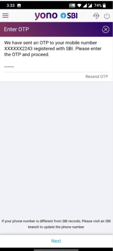
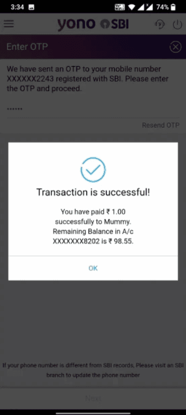
The old OTP screen lacked auto-detection and had poor input visibility which slowed down the user experience. The new design improves readability and supports quicker input, making the process smoother and faster.
We removed the extra text to create a
cleaner layout and focus the user's
attention on the logo and core tagline